To reflect a rapidly changing political discourse, The Huffington Post sought to move away from its “first internet newspaper” origins and cast a wider net by positioning itself as “the people’s platform.” With new leadership at the helm, the media company transformed from “The Huffington Post” to “HuffPost,” both as a nod to its commonly used nickname and an efficient solution on social and third-party media platforms.
Our challenge was threefold: create a new logo with the shortened name, keep the provocative headlines front and center and move the focus of the platform from the internet to the app.
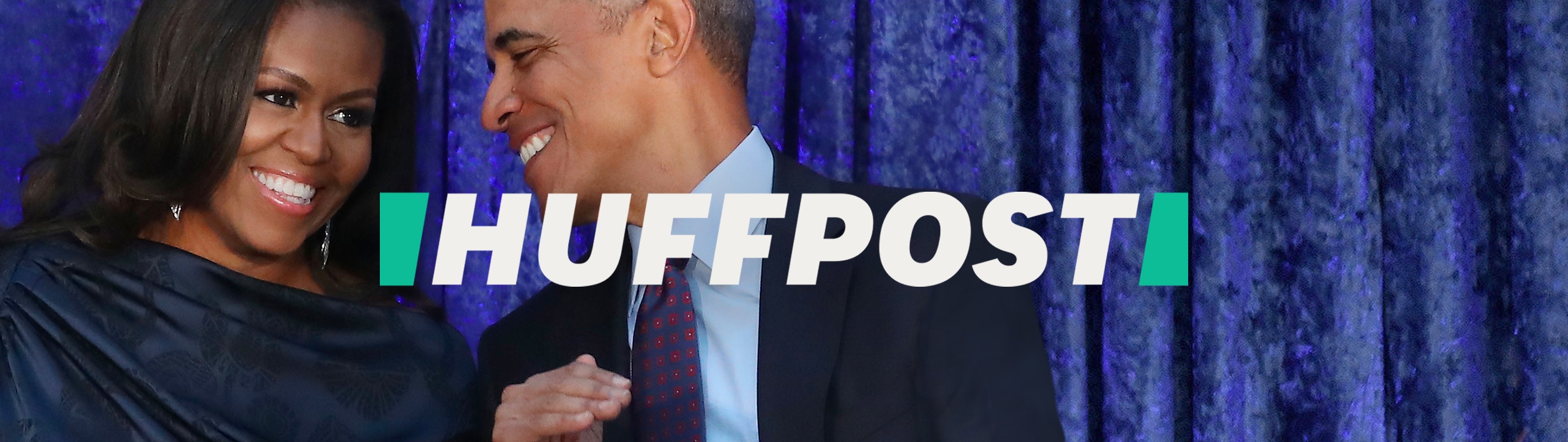
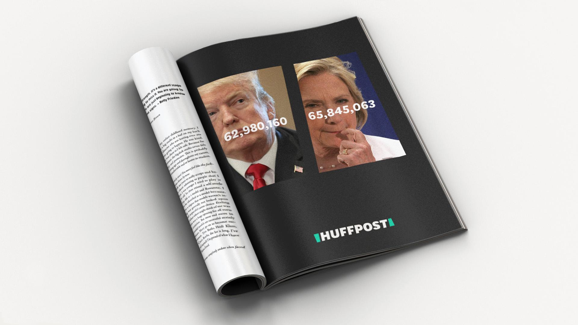
LOGO
BRAND SYSTEM
MOTION DESIGN

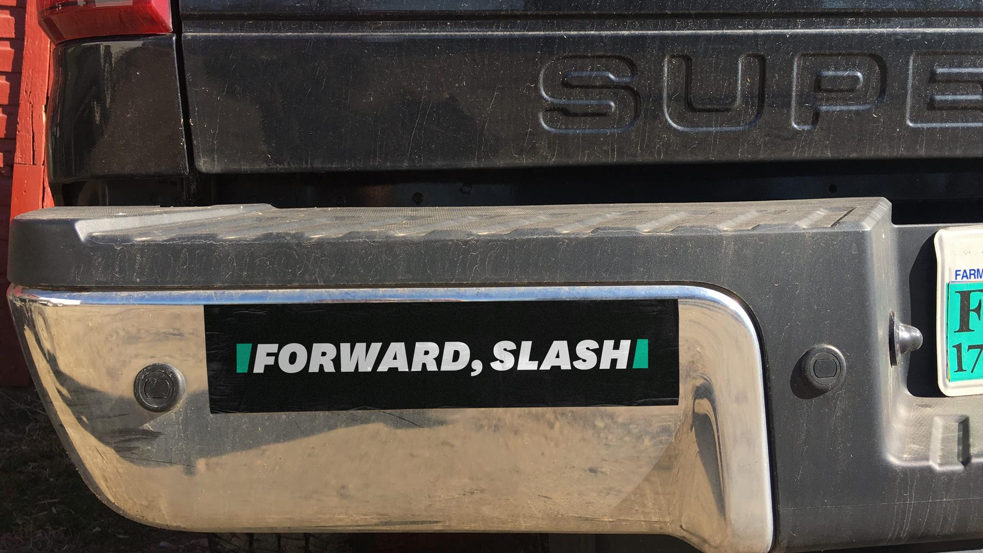
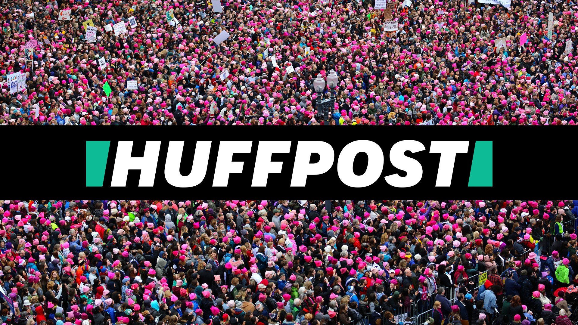
Work-Order created a symbol made of slashes to form an “H” that bookends the wordmark and content. In motion, the “H” becomes a metaphor for people coming together, connecting and moving away from each other — inclusive and expansive.
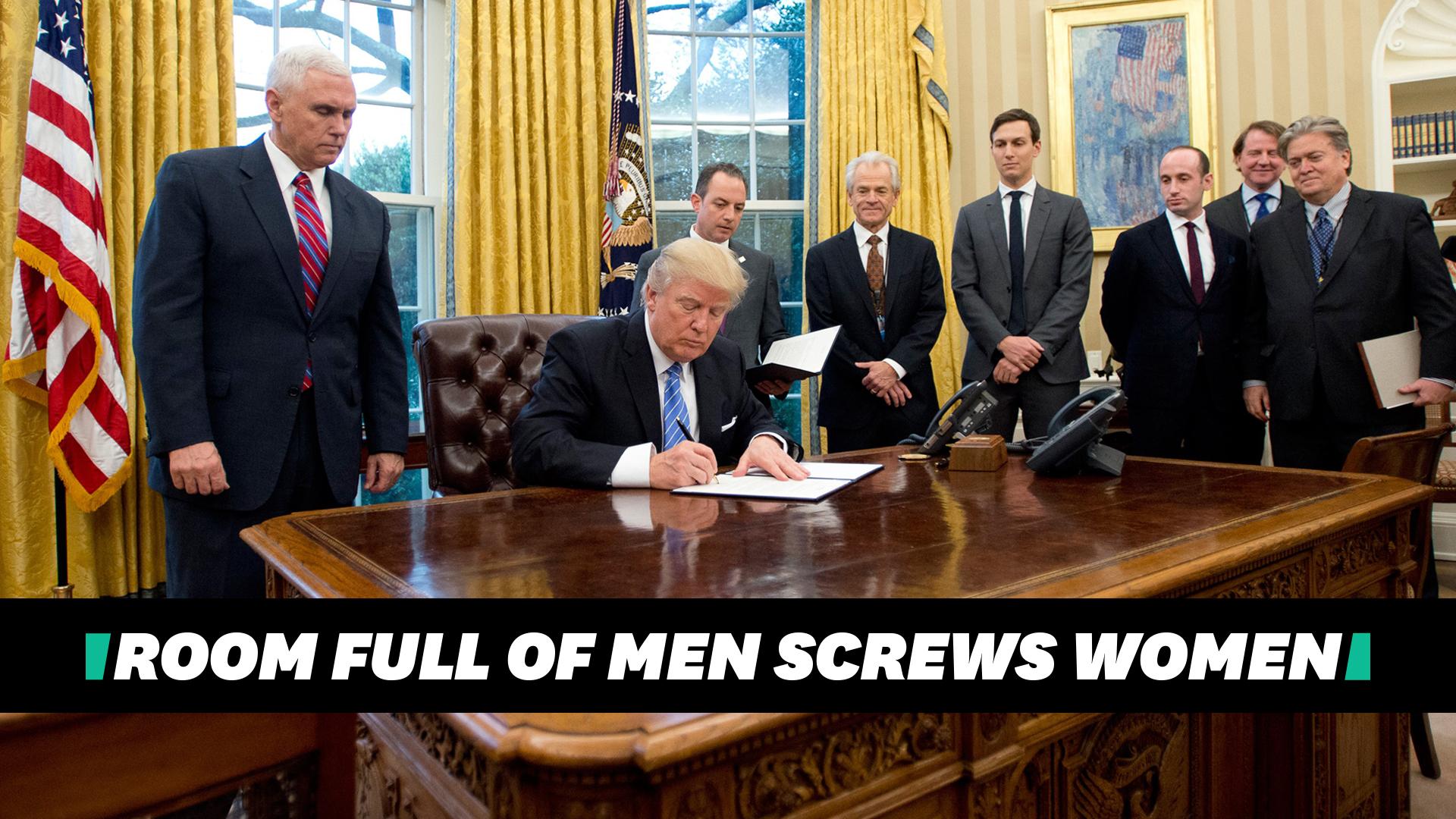
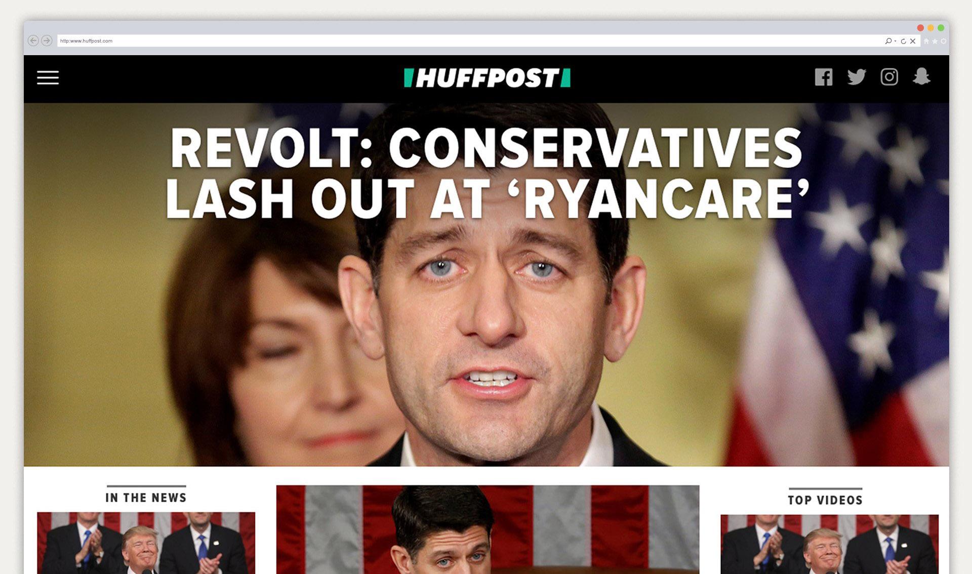
Headline design as editorial strategy
Headlines take on the properties of the brand. The bold italic “tabloid” logotype conveys urgency and outrage.


Our real role is to stand up for the little guy, to represent people who feel like they don’t have a voice. We are here to listen and to amplify their voices.
— LYDIA POLGREEN, EDITOR-IN-CHIEF, HUFFPOST
GOOD PRESS / BAD PRESS
© 2021 WORK-ORDER
© 2019 WORK-ORDER