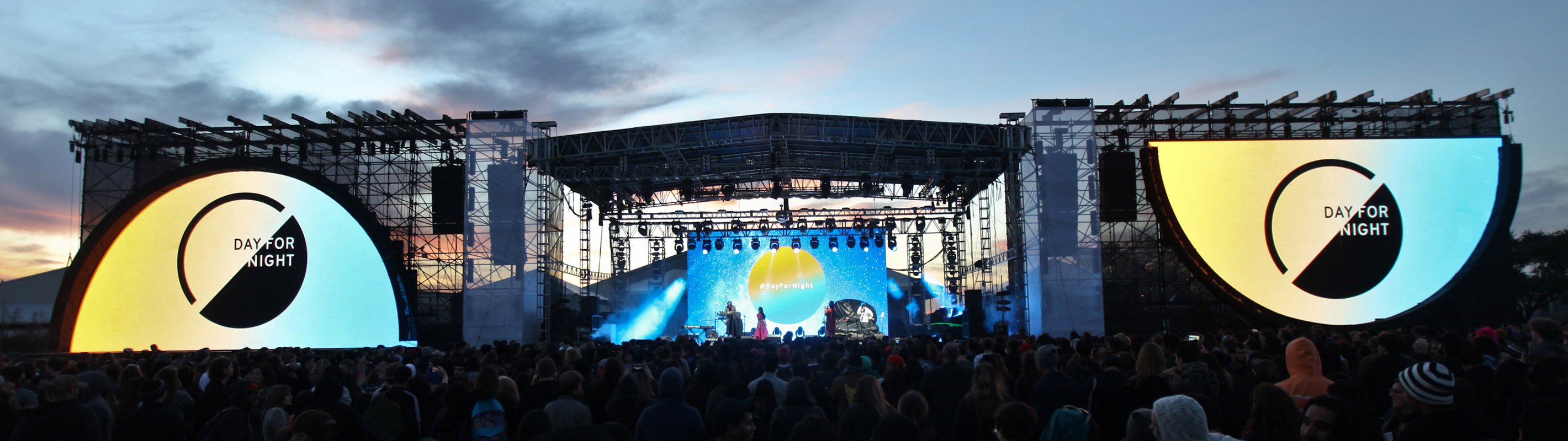
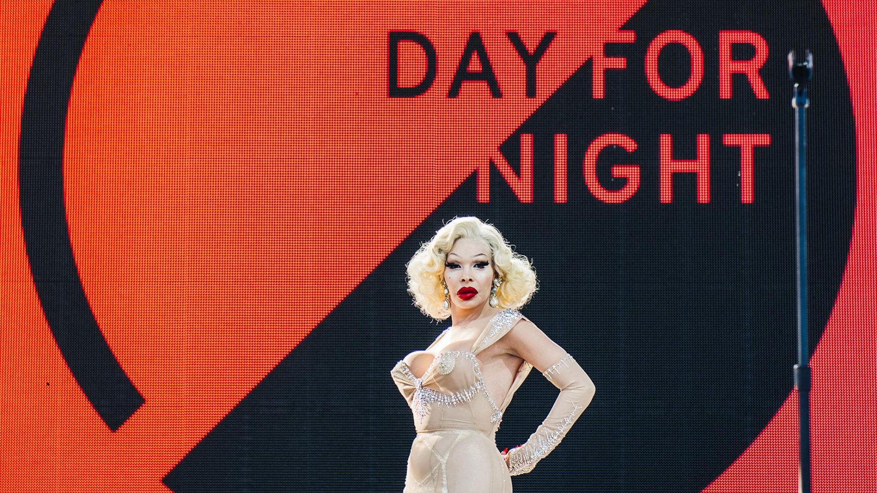
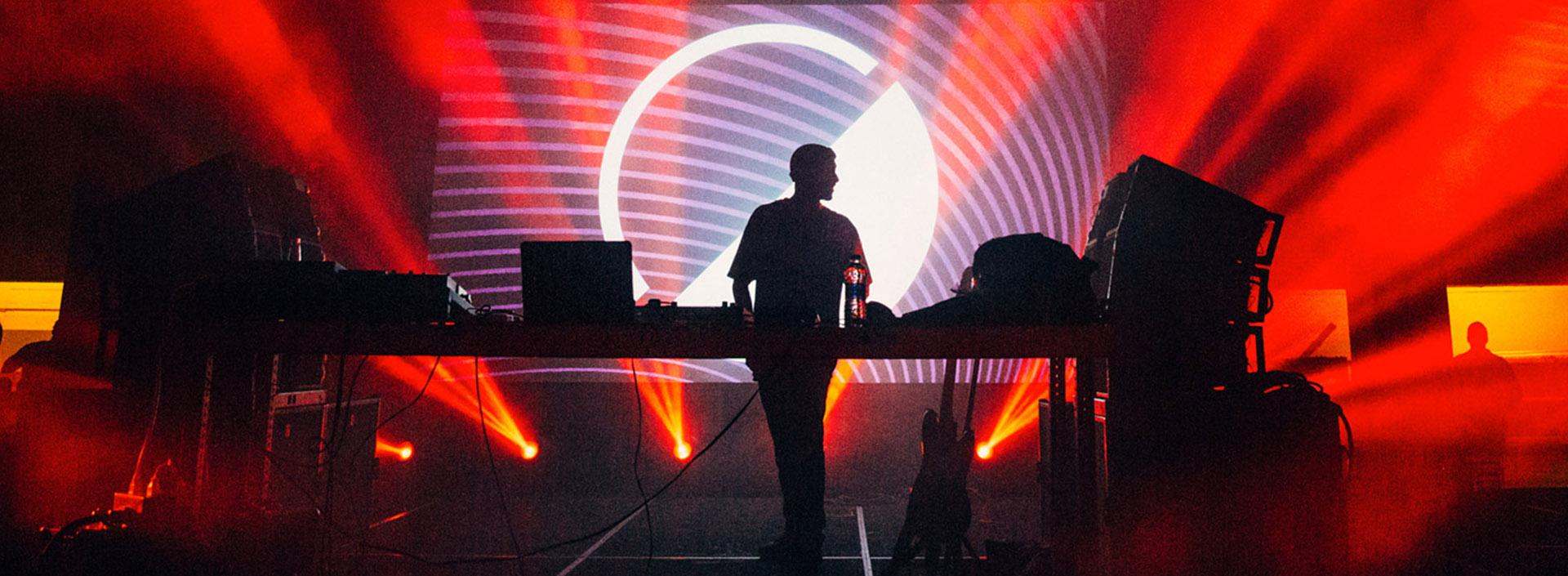
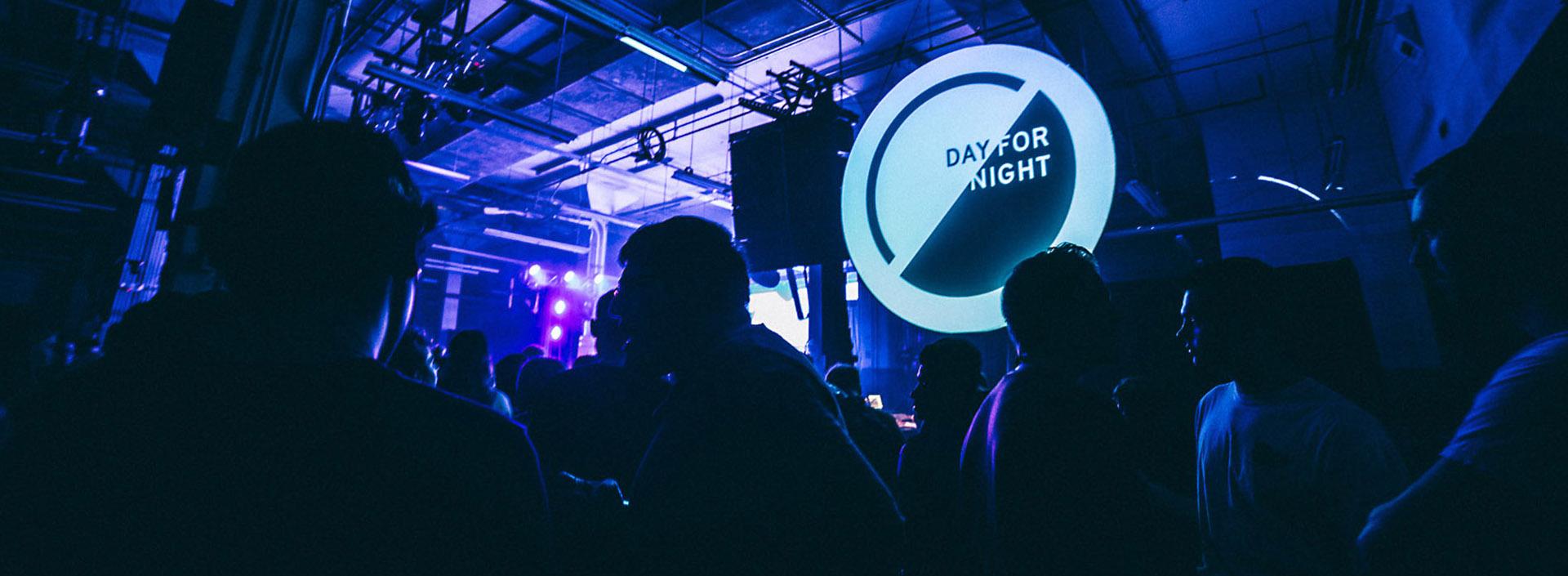
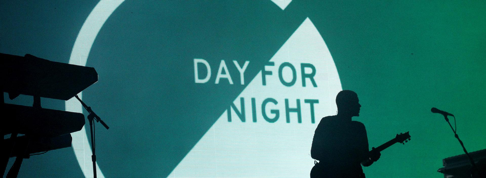
Music festivals rarely look as dynamic as they sound, so we embarked on making our own festival, Day for Night. Work-Order embraced the opportunity to fundamentally elevate this experience, tapping all the senses with a mind toward the visual components.
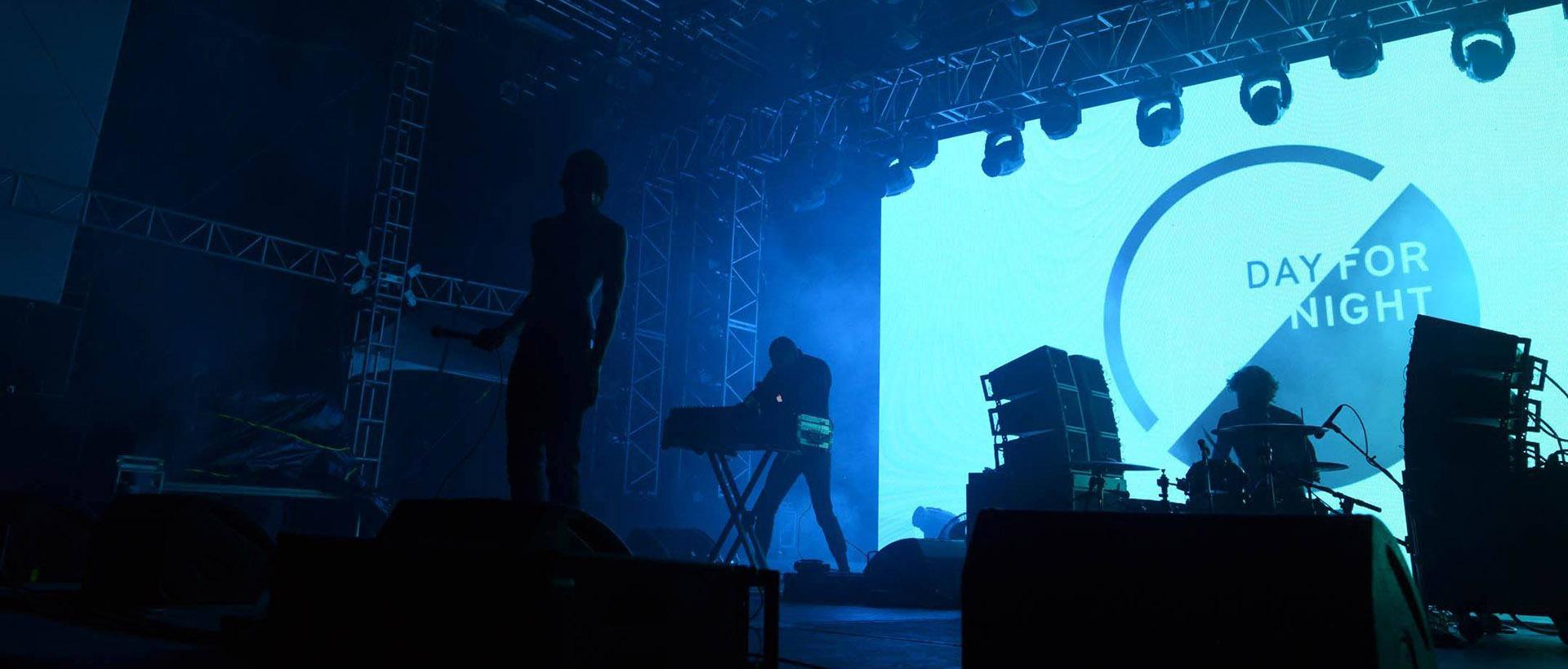
We created “a collision of light and sound” with integrated interactive art installations on par with the event’s international selection of musicians. Contrasts and transformation, light and dark and extreme noise and silence were the core elements that informed our branding approach. The festival, which ran for three years, was at the forefront of the now de rigueur interactive format for festivals.
CONCEPT
CREATIVE DIRECTION
NAMING
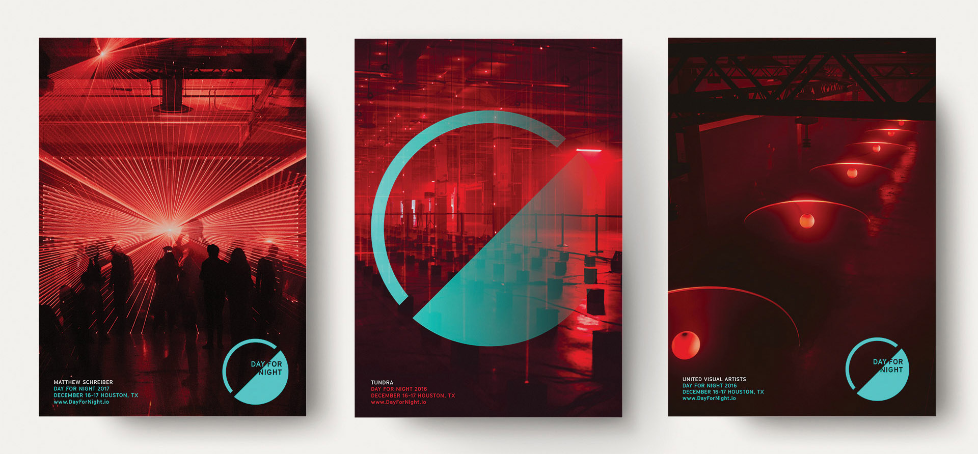
LOGO
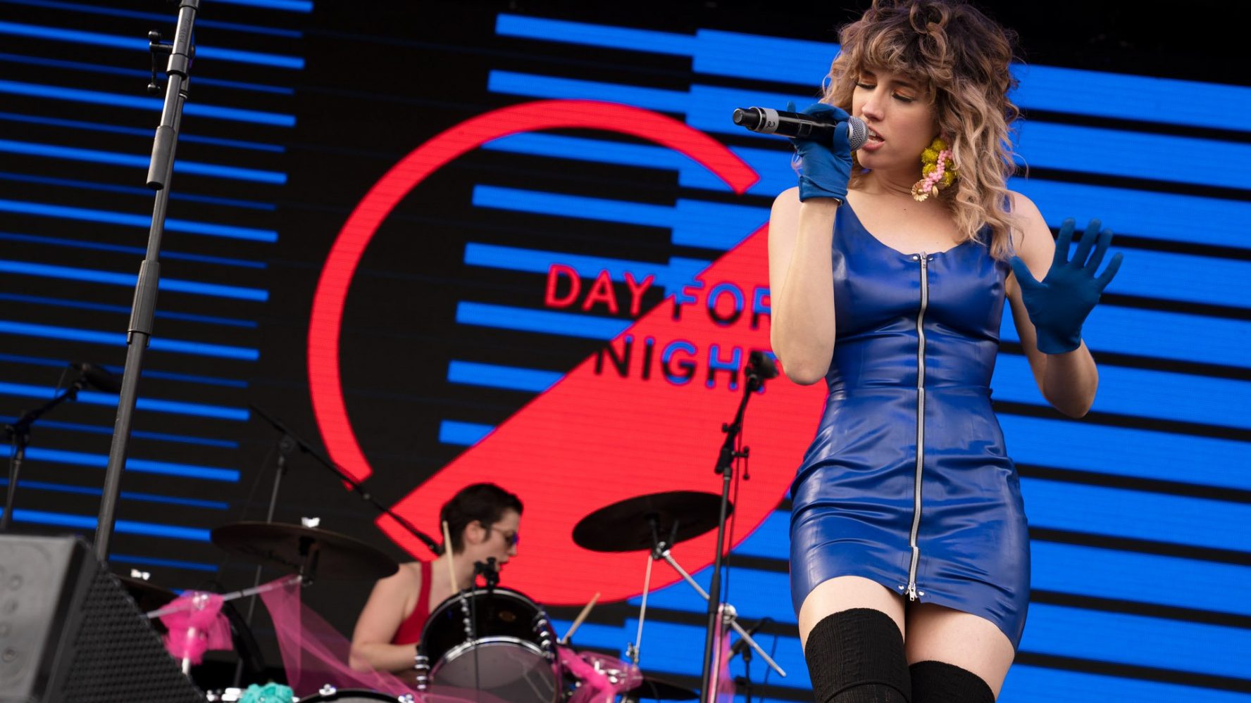
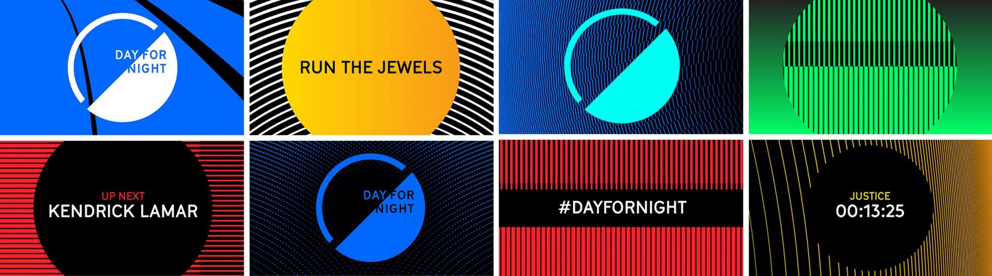
BRAND SYSTEM
ENVIRONMENTAL DESIGN
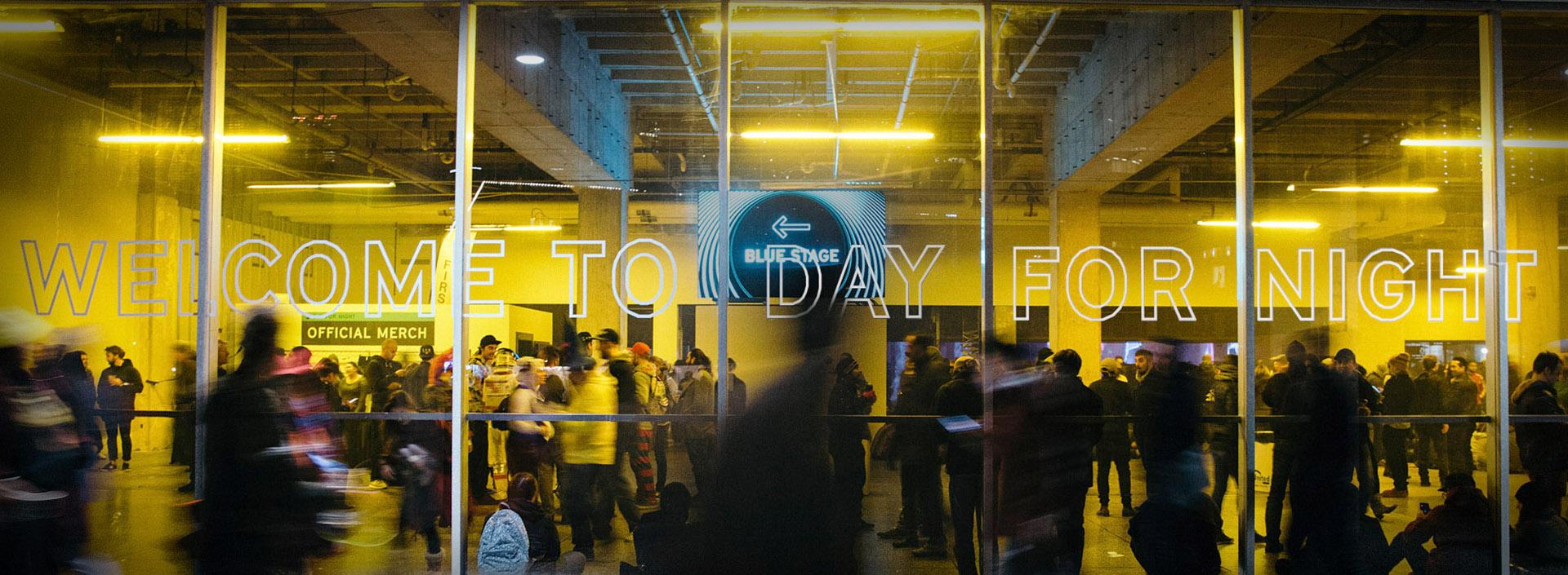
EXPERIENTIAL DESIGN
WAYFINDING
COPYWRITING
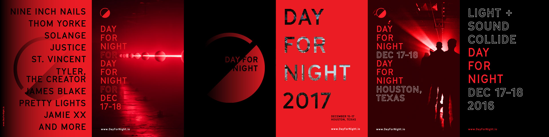
CAMPAIGN
Branding at scale
Best Festival of the Year, 2017
— CONSEQUENCE OF SOUND
Day for Night stands for forward-thinking music that incorporates breathtaking visuals to match.
— JOHNSTON FARROW, CULTURE MAP
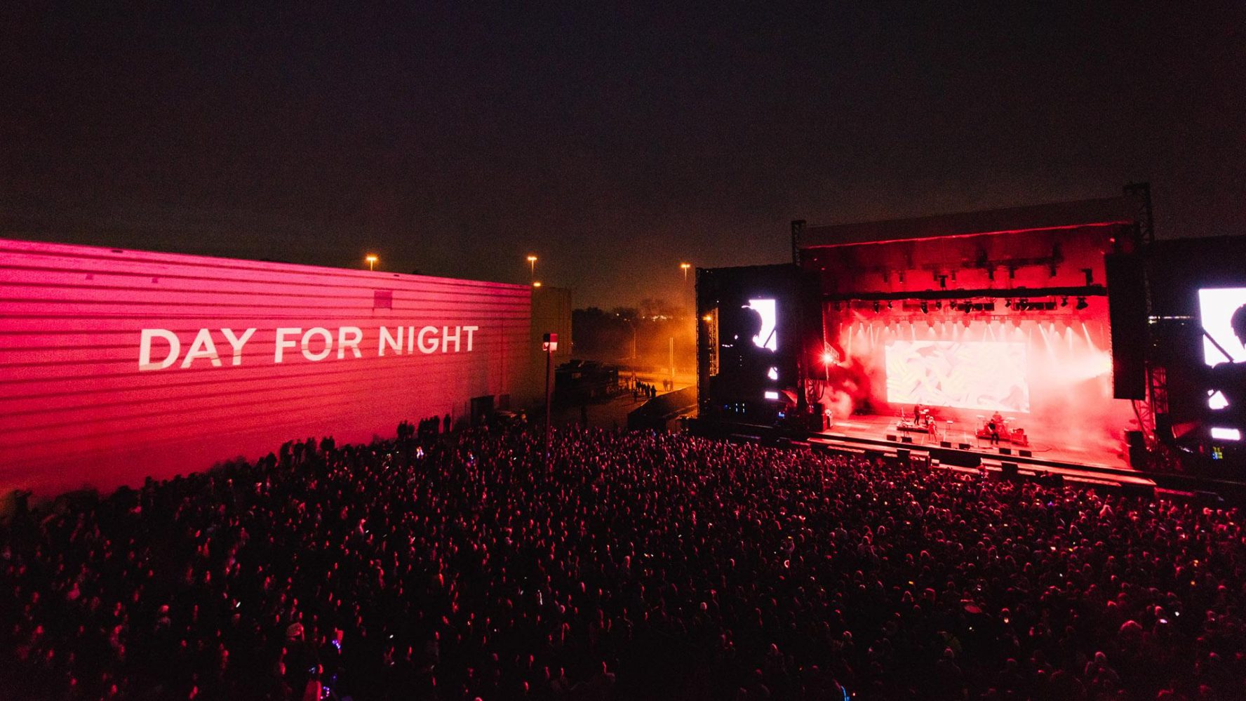
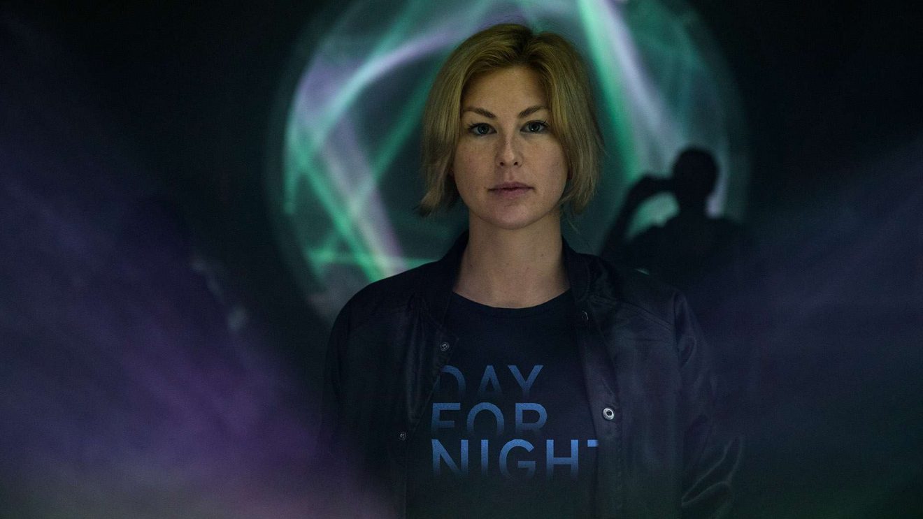
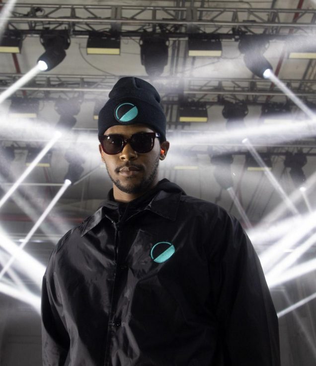
Audio visual overload
Sly animations tease the event


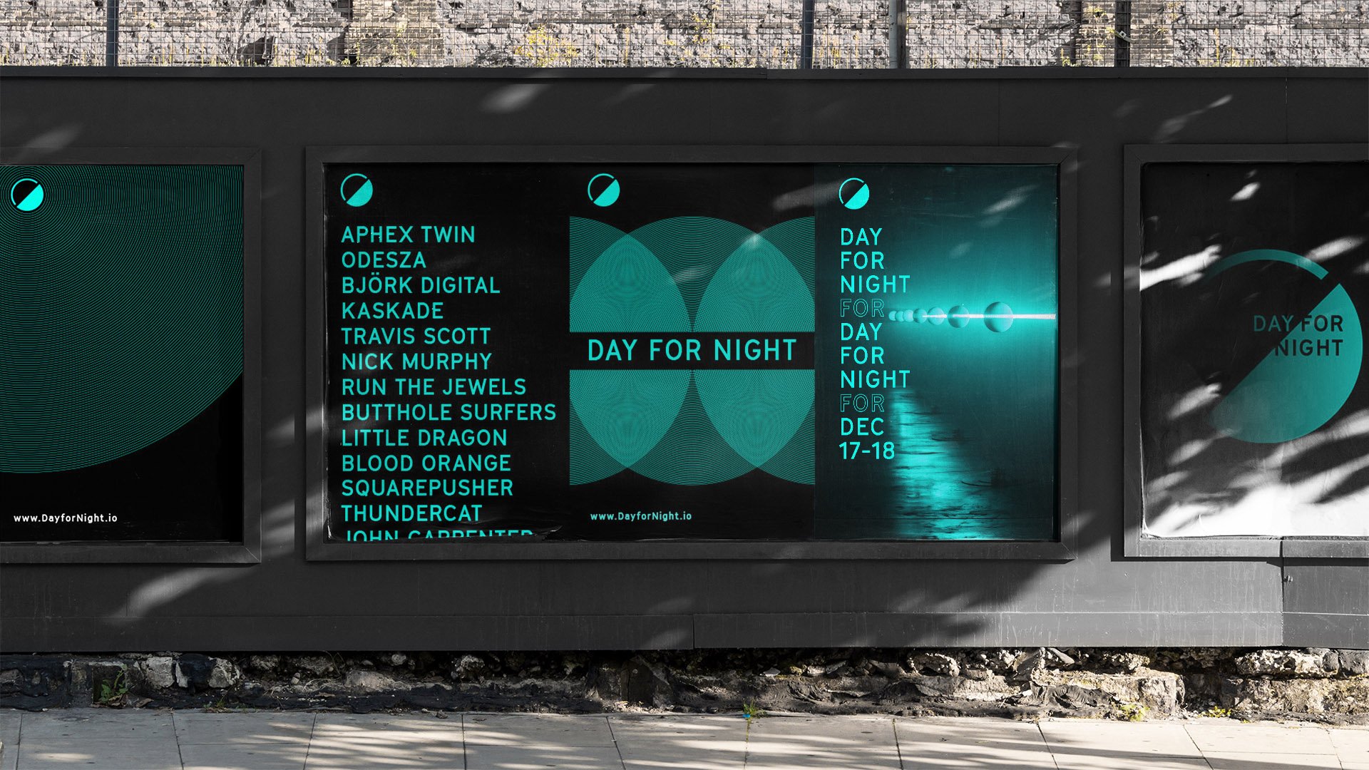
Day for Night’s marketing materials were shrouded in mystery, and looked much like the festival experience itself: dark, evocative and sexy. Lineup posters revealed a cropped version of the artists to pique curiosity, and videos flash-framed hints of the yet-to-be-built immersive art installations.
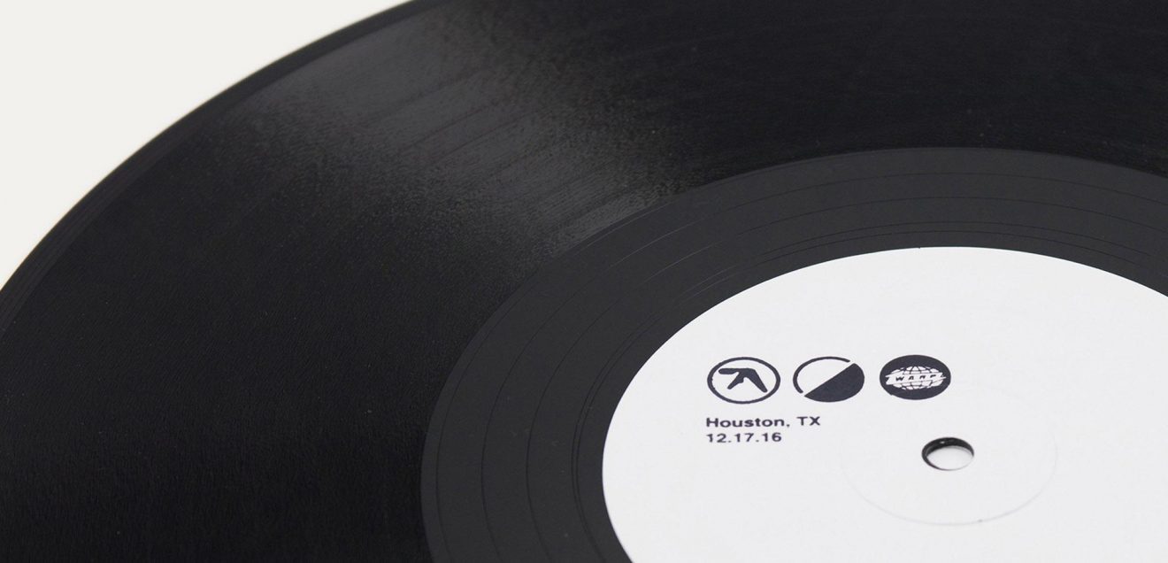
Innovative social media posts, such as the festival logo transforming into Aphex Twin’s symbol to tease the artist’s inclusion in the 2016 festival pre-lineup release went viral in the press.
Revealing the lineup
Finding your way in the dark
Bold design, powerful delivery, and fearless messaging. A utopian space for sensorial experiences to run rampant.
— TAYLOR IRWIN, BANDSINTOWN
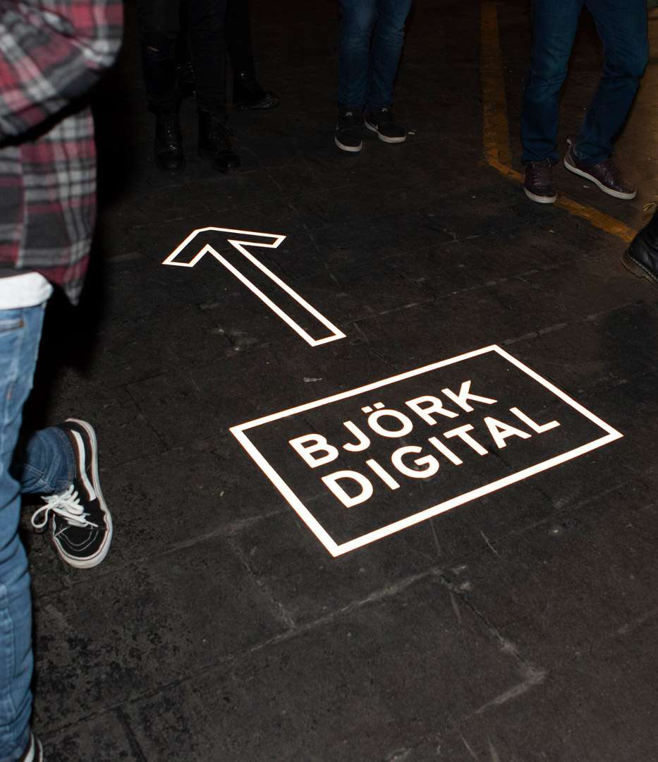
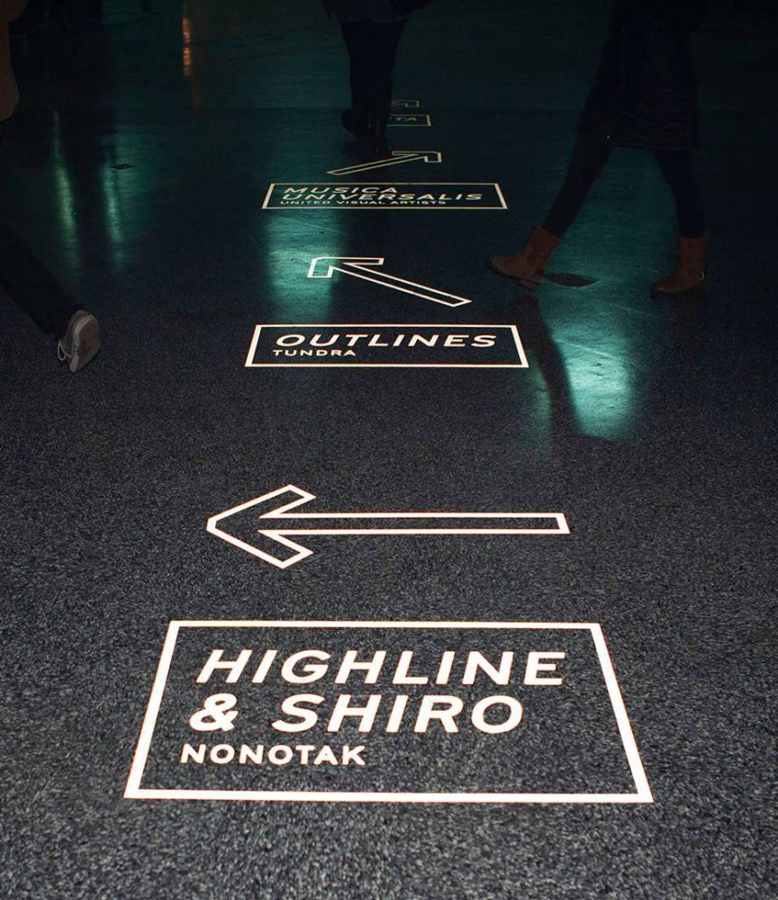
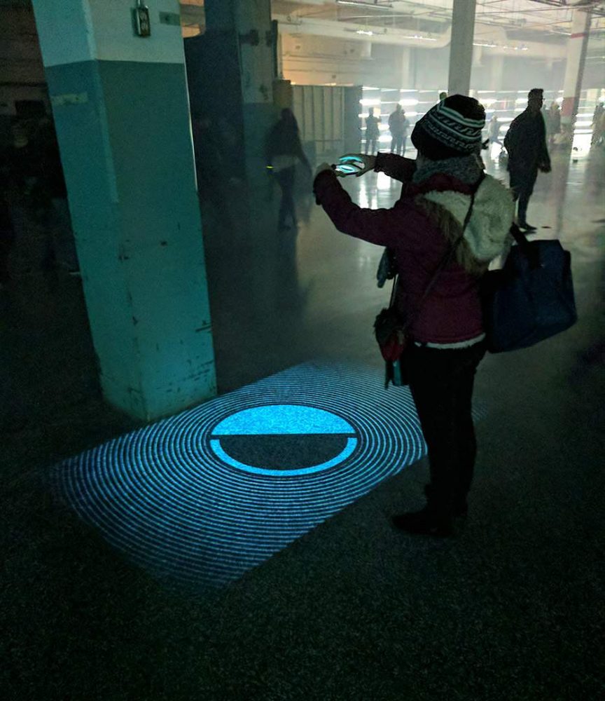
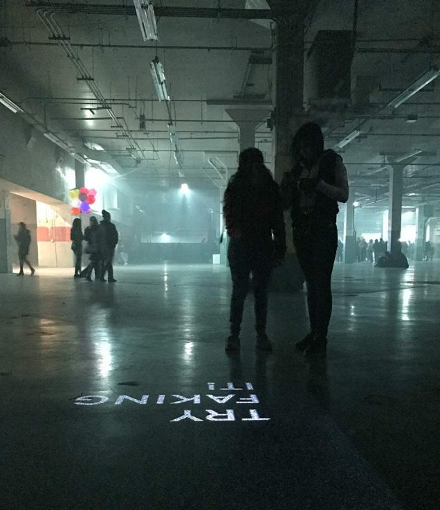
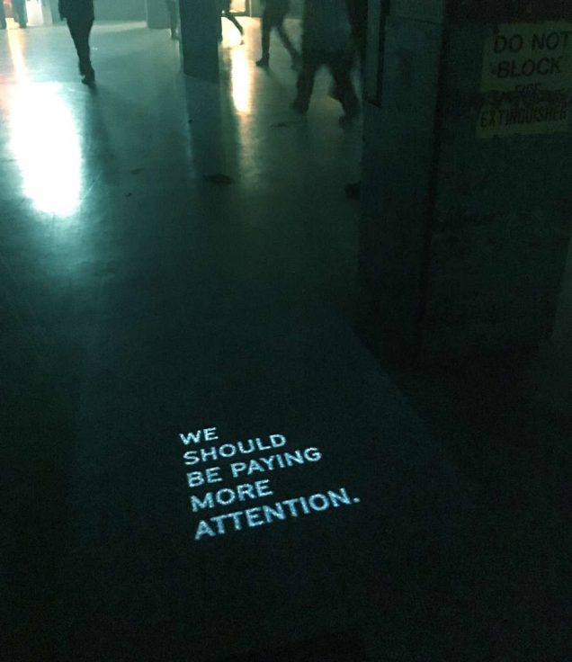
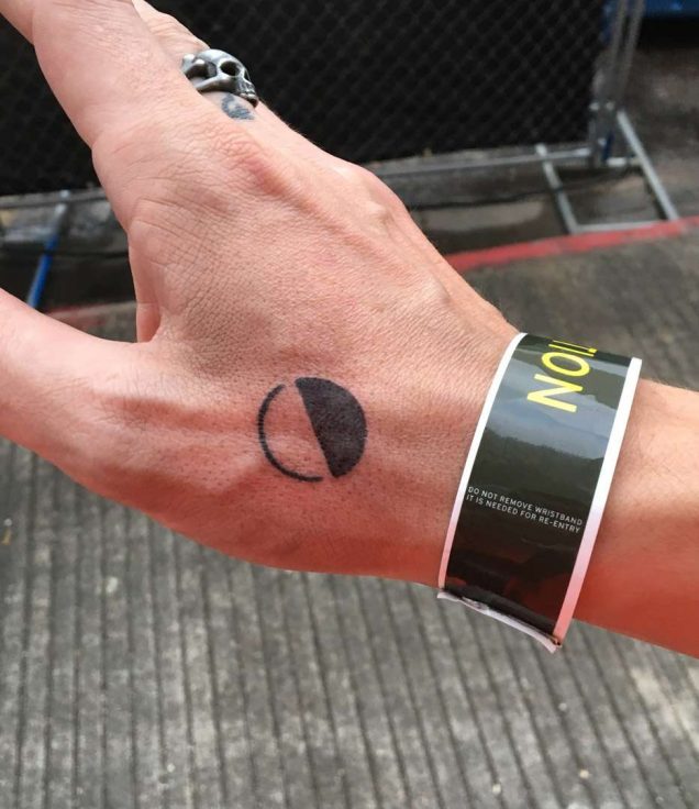
The voice and messaging for Day for Night was established throughout the campus via animated witticisms that appeared underfoot and through oversized, treasure map-style arrows pointed in the direction of festival goods.

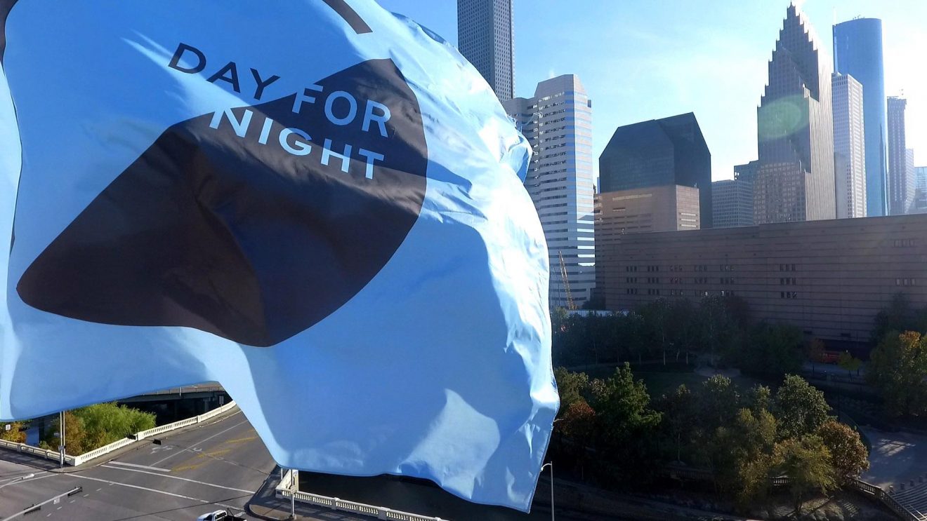
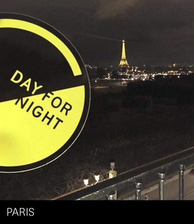
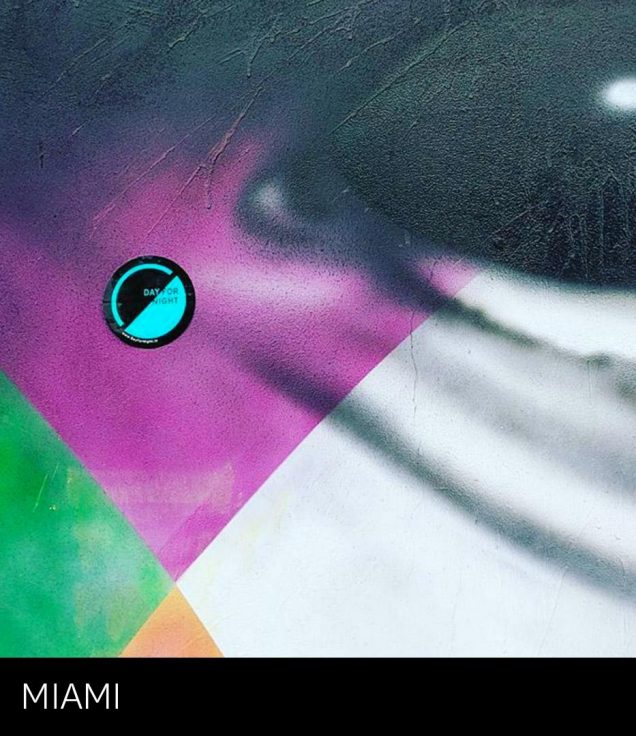
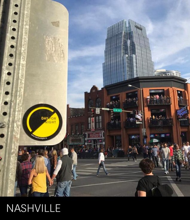
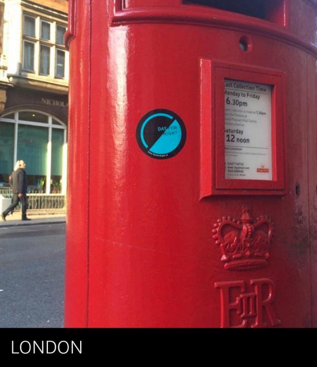
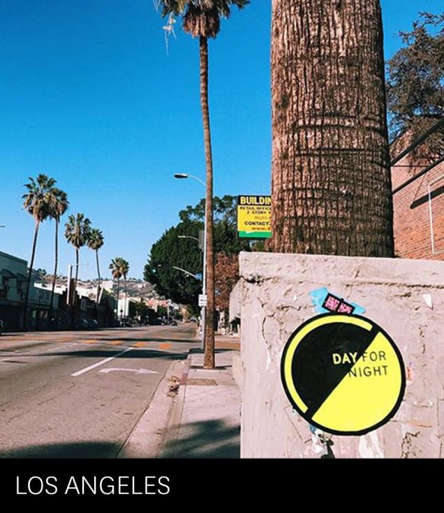
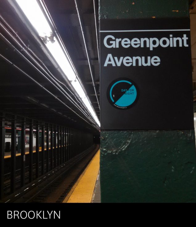
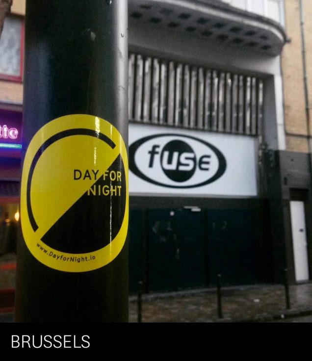
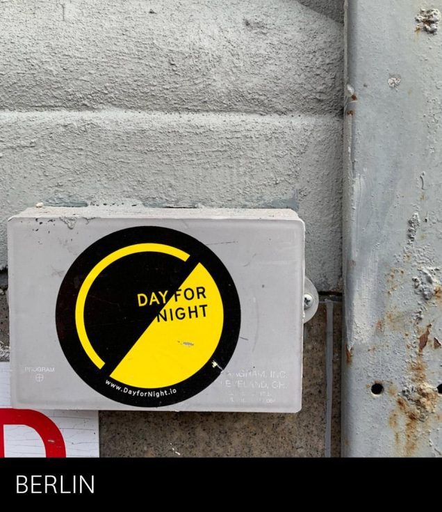
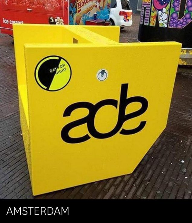
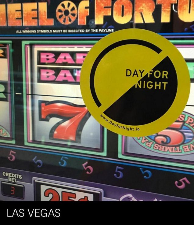
Proliferating the mark
Behind the scenes
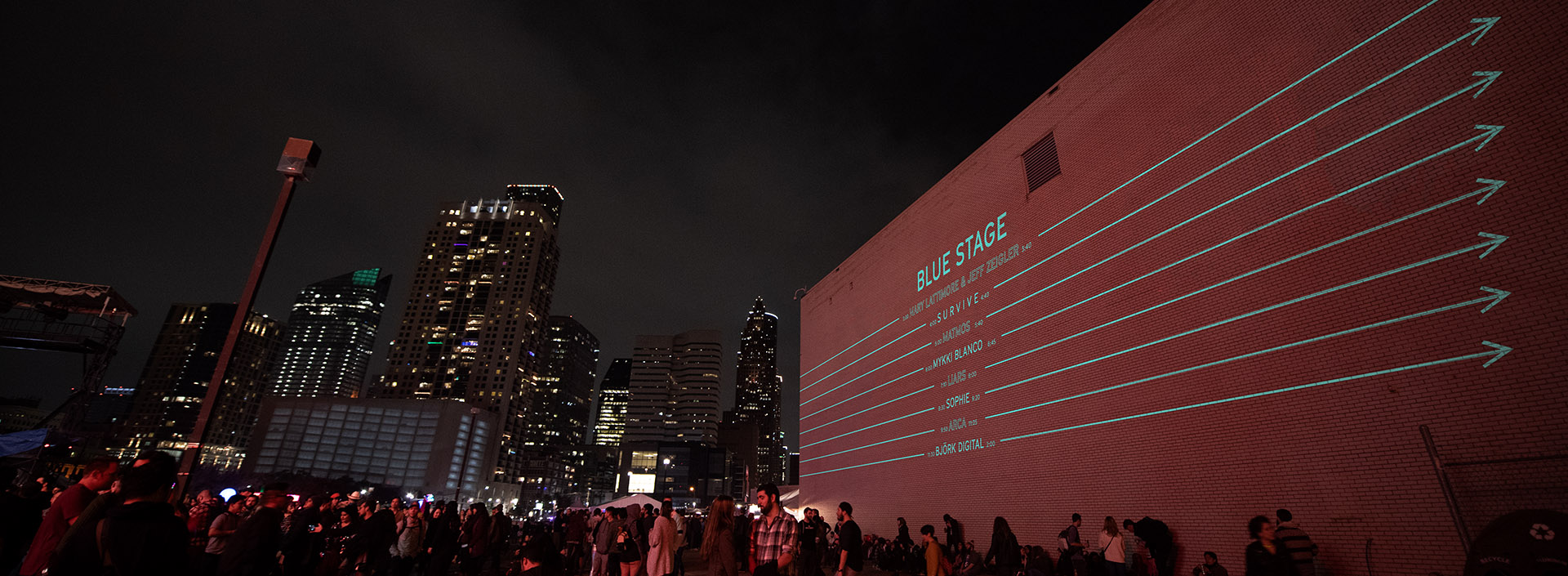
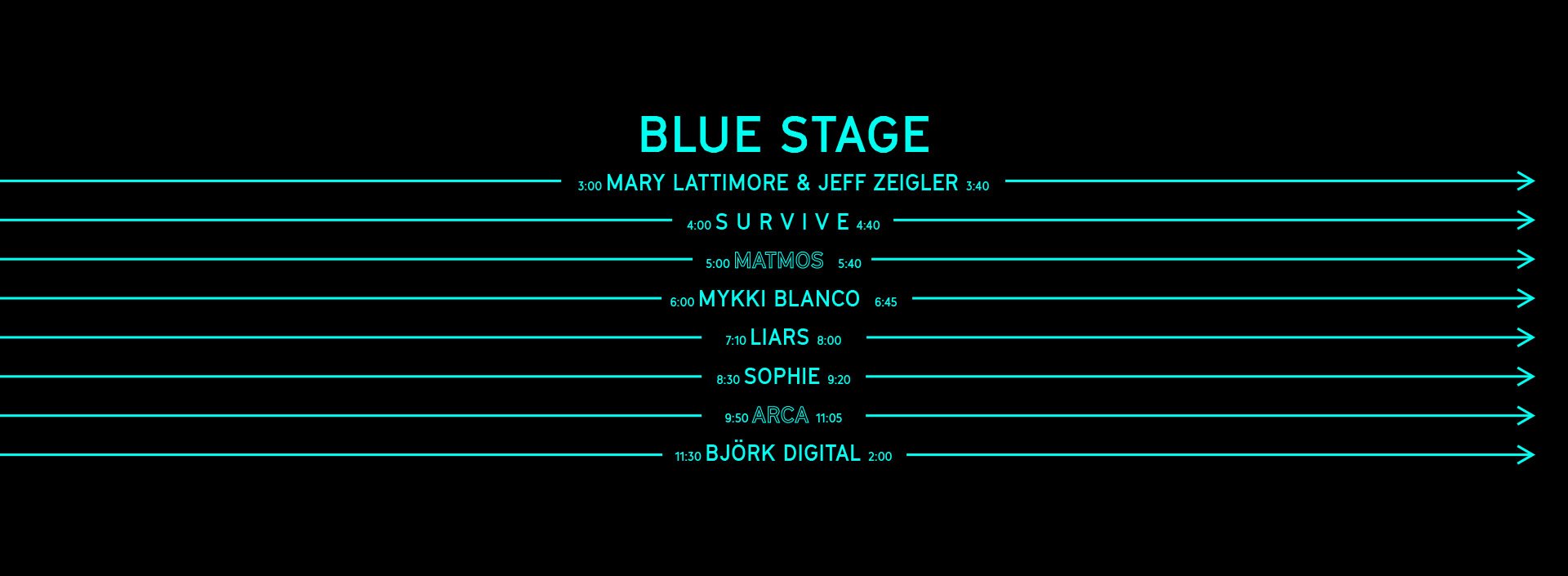
Building the setting for Day for Night was a 16-acre, three-dimensional logistical undertaking. This jigsaw puzzle of site maps, rigging, stage design, installations and wayfinding made exploration and wanderlust a key part of the experience.
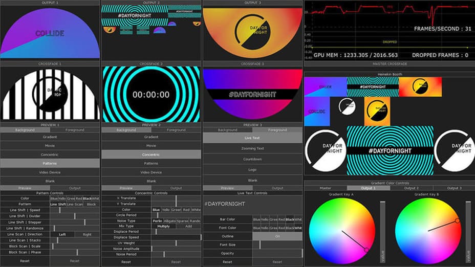
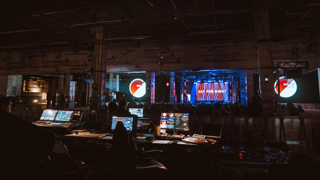
At the festival, presenting the four-stage schedule was a key piece of communication. Custom-built software fed continuous live feeds of social media, countdowns, footage playback, processing-driven graphics and real-time festival messaging.
ACCOLADES
Ranked #3 of the top 10 Festivals, 2016 and Festival of the Year, 2017 by Consequence of Sound.
DOCUMENTATION
Photography:
Theo Civitello
Roger Ho
Julian Bajsel
Katrina Barber
Chad Wadsworth
Ismael Quintanilla
Mark C. Austin
Brandon Holley
Greg Noire
Video:
Mark Armes
Rick Darge
© 2021 WORK-ORDER
© 2019 WORK-ORDER